Services
Research
Design Strategy
Visual Design

Industry
Services / Public Sector Technology
Platform
Mobile App (iOS & Android)
Overview
Let me tell you what this project actually is.
Getting a driving license in India is something millions of people have to do. And yet it's consistently one of the most frustrating civic experiences in the country. Long queues, confusing websites, missing documents, wrong counters and number of paid agents waiting outside every RTO to profit from all of it.
I chose this project because I wanted to work on something with real stakes. Not a startup with a clean design team and good APIs. A messy government process that serves people who can't just try again later.

Problem Statement
I almost designed the wrong thing.
When I first looked at this project, the obvious move was to redesign the app. Make it cleaner. Fix the navigation. Better colors. I almost did that. I'm glad I didn't.
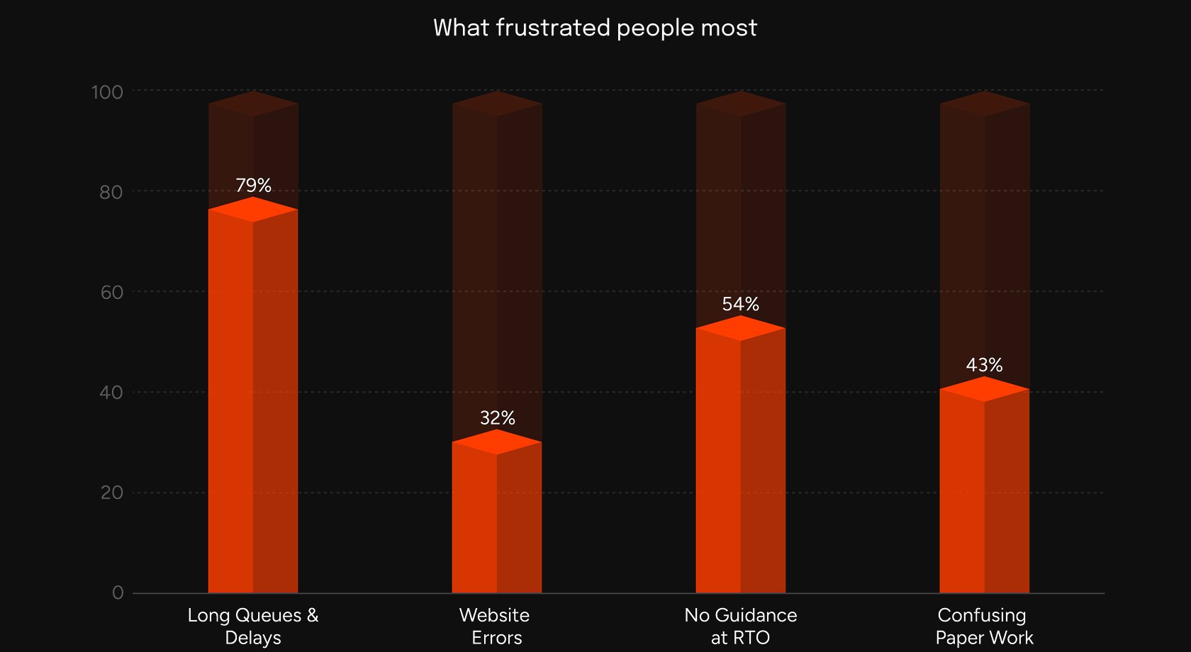
Here's what stopped me. I started asking people what they actually did when they needed a driving license. And the answer was almost always the same, that they hired an agent.
Not because they couldn't use apps. Most of them could, but they hired an agent because they were scared of making a mistake and having to come back. A wasted trip isn't just an inconvenience it means another day off work, another 3-hour queue, another round of figuring out which counter you're supposed to be at.
"I don't want to make a mistake that costs me another visit."
That one sentence changed everything for me. The problem wasn't that the app was ugly. The problem was that no digital tool had ever made people feel confident enough to try on their own. That's a completely different design problem.
The Real Problem
Millions of people in India depend on paid agents to do something that should be completely self-service. Not because they lack the ability, but because the system has never given them enough clarity, guidance, or trust to try alone.
Discover
You can read a lot from your desk reviews, forum posts, policy documents, app ratings. I read all of it. Then I went anyway, because reading about a place and standing in it are very different things.
Before visiting, I mapped out the entire RTO ecosystem - every stakeholder, every touchpoint, every connection. I needed to understand who was involved before I could understand what was failing.

The map immediately showed something important, agents weren't a bug in the system. They were filling a gap the official system had left open. That gap was the real design target.
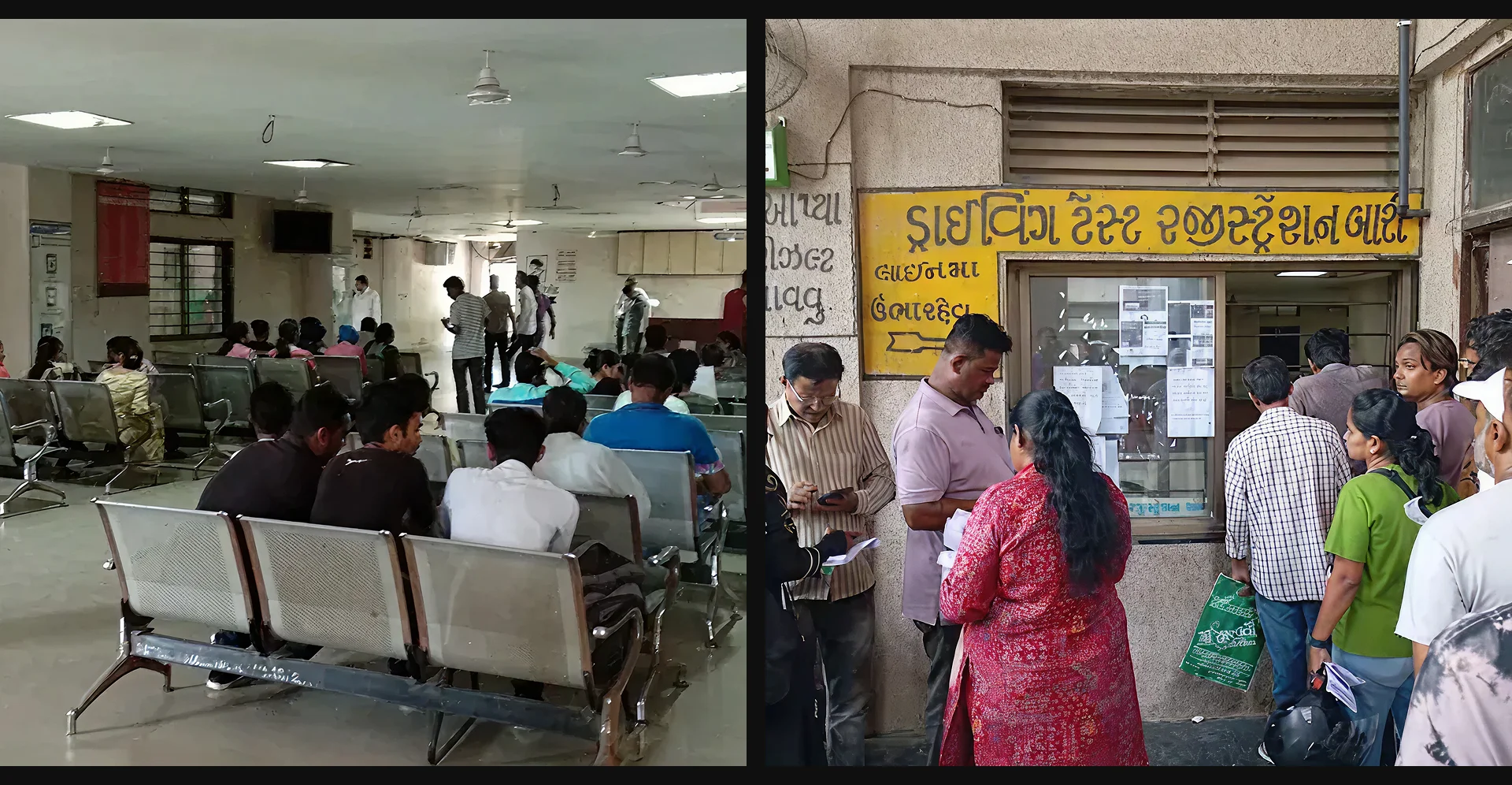
Visits to RTO offices
I visited multiple RTOs across Delhi, Ahmedabad, and Ambala, standing in queues, watching how people navigated, and conducting 24 structured interviews with both applicants and RTO staff.

What only the field could tell me.
After the visits, I sat down with everything I'd heard and seen and mapped it into a research. The same issues kept appearing from different directions - trust, clarity, fear of mistakes, physical discomfort, language barriers.

Define
What the Field Changed
Three things I got completely wrong at first.
01 What I assumed → What I found
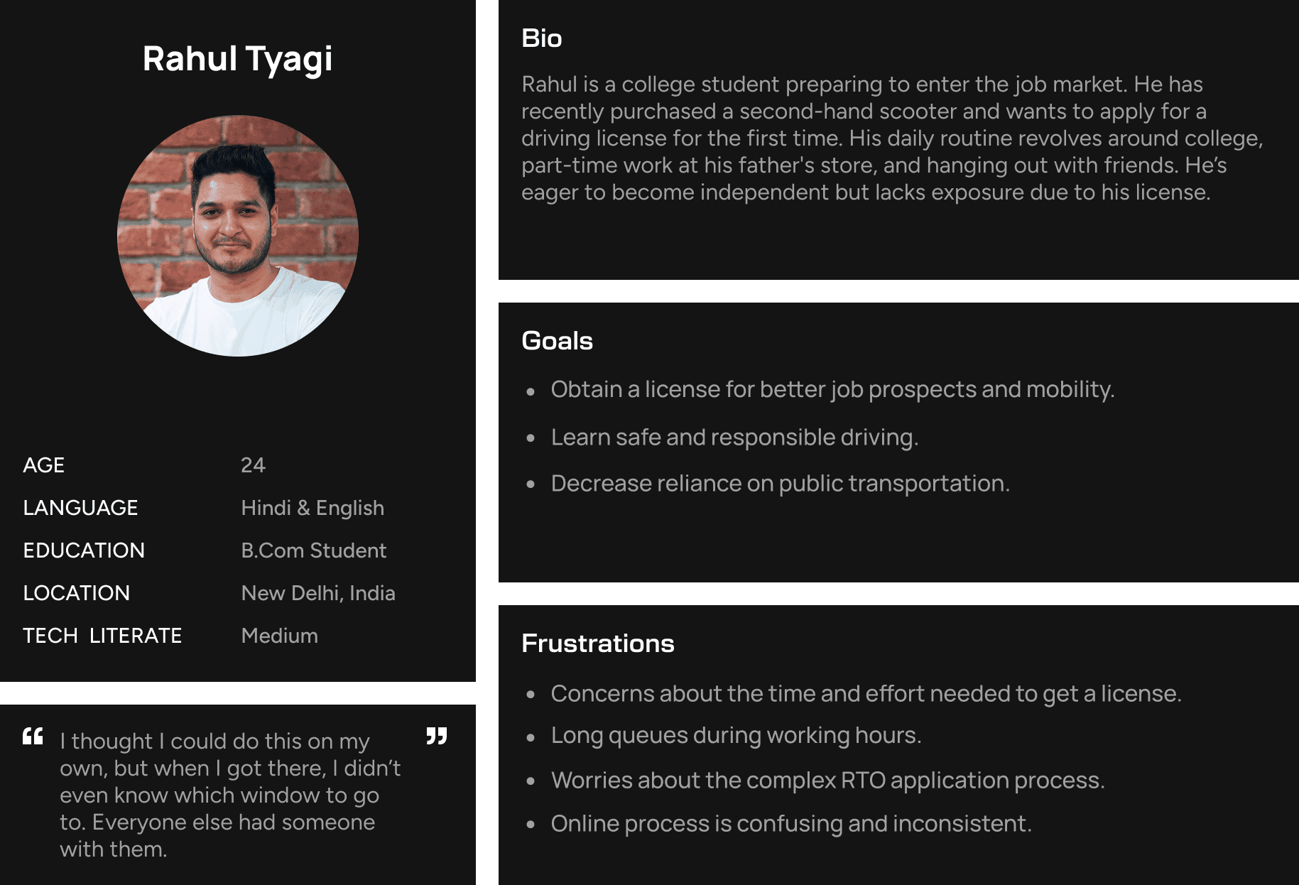
I first created a female user persona based only on online research and reports. From that, I assumed everyone is mainly facing digital issues like understanding the process or filling forms online.
But when I visited the actual offices, I realized the real problems were different.
The corridors and halls had poor lighting. Toilets were broken or missing. There were no proper signboards to guide people. And very few women were there alone.
It didn’t feel like a space designed for everyone. Specially for women, each visit meant extra effort - dealing with discomfort, safety concerns, and arranging someone to go with them. If a visit failed, it often meant asking someone else to handle it instead.
What this changed in the design
The step-by-step guidance, the complete document checklist, the slot booking — all of it became about reducing the number of visits required. If you can prepare so thoroughly through the app that your first trip goes perfectly, the physical environment becomes a one-time obstacle instead of a recurring one.
02 What I assumed → What I found
I thought Hindi and English would be enough. They weren't.
My original plan was a bilingual app - Hindi and English. That seemed like the sensible, practical choice for a national product. Research showed me why it wasn't.
India doesn't have two languages. It has dozens of them, each with different scripts, different literacy rates, and different levels of comfort with digital interfaces. A person applying for a license in Gujarat, Tamil Nadu, or Punjab isn't struggling because they can't read English. They're struggling because no part of the official system has ever spoken to them in a language they actually trust.
What this changed in the design
Language selection became the first thing you do in NDLS - not something buried in settings. And every piece of text in the app was translated - not just button labels, but the legal text, the fee breakdowns, the error messages. Translating "Submit" while leaving the instructions in English defeats the whole point.
03 What I assumed → What I found
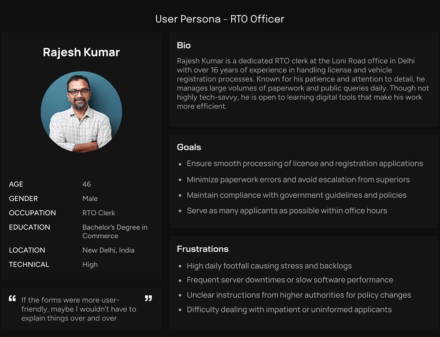
I was only going to build an app for citizens. That wouldn't have solved the problem.
The original brief was a citizen-facing app. That seemed obvious. But at the RTO offices, I spent time watching how the officers worked - and realized that designing for one side only would fix nothing.
Officers were getting interrupted constantly. Applicants would leave the queue and walk directly to an officer to ask:
"What documents do I need?"
"Where's my application?"
"Why was I rejected?"
The same questions, over and over, all day. Officers weren't failing people - an inadequate system was failing both of them simultaneously.
If citizens had better information, they wouldn't need to interrupt officers. If officers had better tools, they could process faster and make fewer errors that generated more questions. Building the officer dashboard wasn't adding scope - it was the only way to honestly fix the problem.
What this changed in the design
The officer dashboard was designed with completely different principles from the citizen app. Officers don't need handholding - they need speed, density, and efficiency. Different information hierarchy, different interaction patterns, different everything.

Ideating
From what I found to what I asked.
Before jumping into solutions, I turned every research finding into a question. It's a small discipline that makes a big difference - it keeps you focused on the problem, not just generating ideas.
Make the process feel safe enough that someone tries it alone for the first time, without an agent?
Give people the full process in their own language - not just the buttons, but the legal bits too?
Reduce the number of visits so that getting it wrong once doesn't mean a big personal cost?
Give officers a tool that handles routine questions so they can focus on things only they can decide?
Make real-time status so clear that no one ever needs to walk in or call to ask what's happening?


Decisions & Trade-offs
Deciding what to build is easy. Deciding what not to build is the actual hard work. Here are the four biggest things I said no to - and why.
Decision 01
Driving license services only
RTOs handle a lot of services from vehicle registration, permits, and fitness certificates. I scoped down to just driving licenses because that's the highest-volume, most anxiety-filled first interaction. Doing everything would mean doing nothing particularly well.
Decision 02
Mobile-first
A web platform would reach more devices. But research showed first-time applicants are on their phones. Building primarily for web would mean optimising for the wrong person in the wrong context.
Decision 03
New brand not a redesign
I could have worked within Parivahan's existing identity. But participants in my research rated it below 5 out of 10. A new name and brand signals a genuinely new experience before the app is even opened. Trust is built before the first tap.
Decision 04
Accessibility over impressiveness
Some design options looked impressive but didn’t pass contrast and readability standards. This product needs to work for older adults, people with limited digital skills, and those using it in bright sunlight. So choosing clear and simple design was more important than making it look fancy.
Two things I cut
During ideation I explored a live chat feature that would connect applicants directly to officers. Research stopped me: officers were already overwhelmed, and most questions could be answered by better information architecture alone.
I also explored an agent mode - a tool for licensed intermediaries to file applications on behalf of clients. But the whole point of this project was to reduce agent dependency. Building a better tool for agents would have contradicted the thesis entirely.
Design
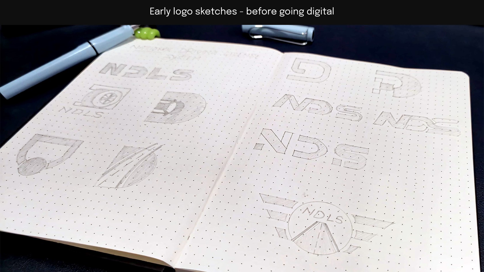
The Brand
I spent time thinking about what to call it before designing anything. I went through plenty of options - some clever, some descriptive, some very forgettable. I landed on NDLS - National Driving License System. It's official-sounding, clear, and it signals something important before you've even opened it: this is a serious product made for you.
The design direction was the Explorer archetype - confidence to move forward, independence, the sense that you don't need someone to hold your hand through this. That thread runs through every color choice, every type decision, every interaction pattern.


Wireframes
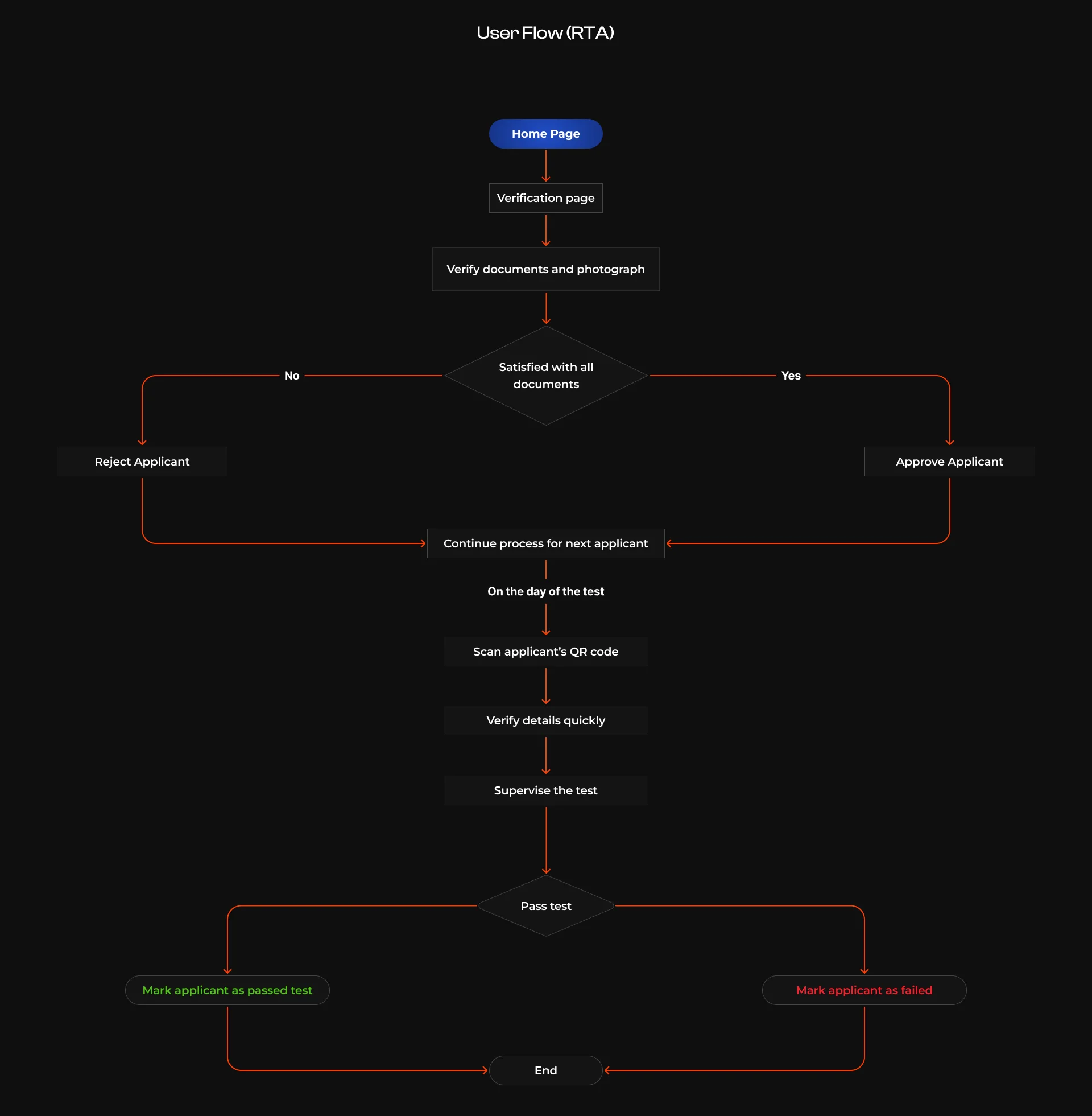
I wireframed the citizen flow first and tested the logic before touching color or typography. The only question at this stage: can a first-time applicant get through this without confusion or help?


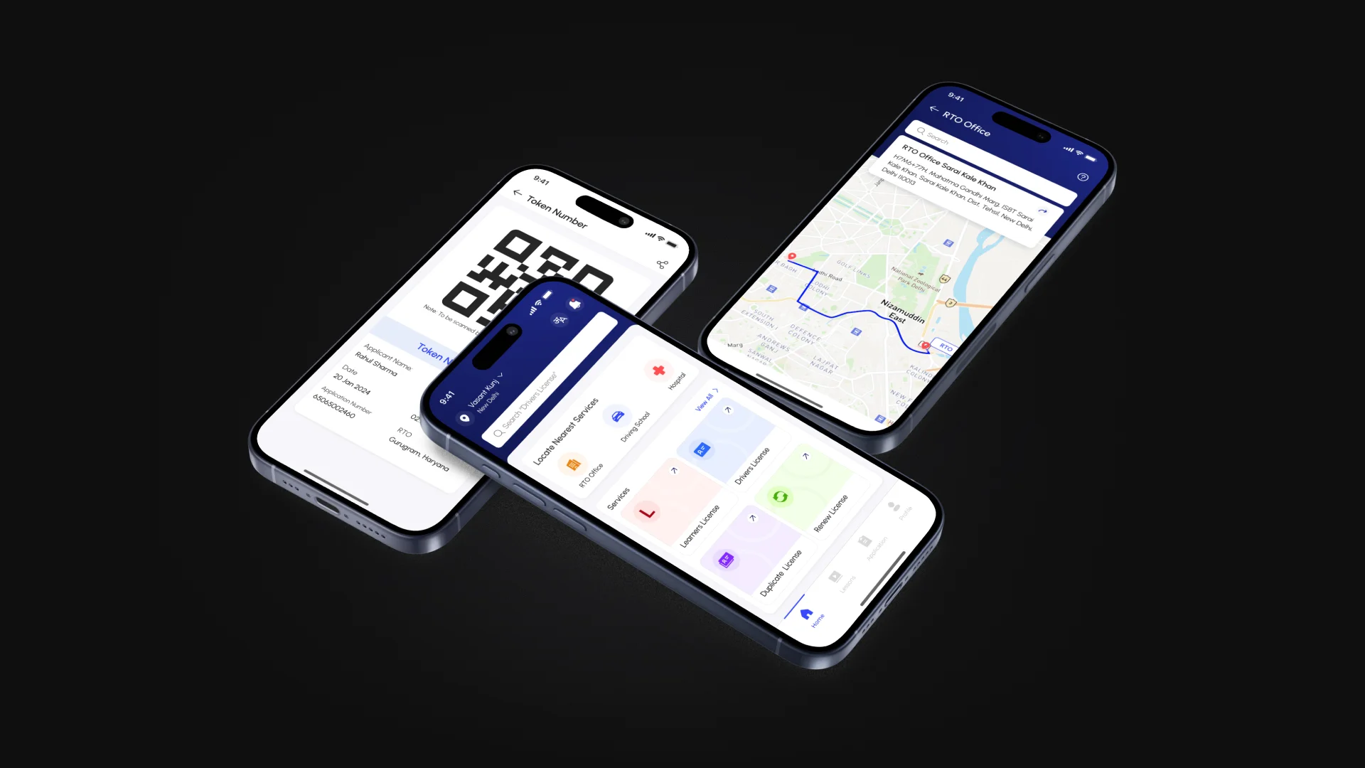
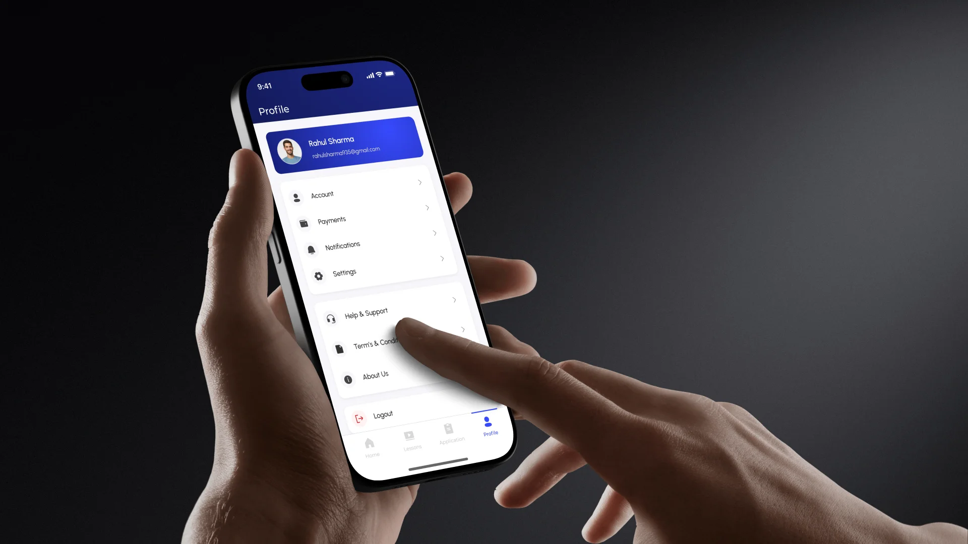
High Fidelity Designs
Here are the final designs for the app and dashboard, showcasing two connected experiences for citizens and officers.


