Services
Research
Design Strategy
Visual Design
Testing

Industry
Workplace Productivity
Platform
Mobile App (iOS & Android)
Overview
Sync Space is a streamlined meeting room booking app designed to simplify the scheduling process with an intuitive interface and real-time availability updates. It helps teams avoid double bookings, manage resources like projectors or whiteboards, and adjust meeting times on the go. By replacing inefficient manual systems, it creates a seamless, stress-free experience tailored to small and mid-sized hybrid workplaces.
Problem Statement
Current meeting room booking systems are fragmented, outdated, and inefficient—resulting in wasted time, double bookings, and poor resource management. In hybrid environments where every in-person moment matters, these inefficiencies disrupt productivity and collaboration
Project Goal
For companies embracing hybrid work, office space is no longer fixed it’s fluid. Different teams come together in-person for collaboration, making it crucial to manage shared resources effectively.
Key Challenges
Booking conflicts, multiple users unknowingly book the same room.
Underutilized of resources, Equipment like projectors and video conferencing tools go unused due to lack of visibility.
Manual booking processes like spreadsheets, whiteboard sign-ups, or verbal coordination are prone to errors.
No flexibility, meetings that run longer or change last minute create confusion and interruptions
Solution
A real-time booking system with visual room availability
Resource tagging to book based on equipment needs
Custom meeting policies to prevent conflicts and hoarding
Instant notifications for changes, cancellations, or extensions
Design Process

Empathize
To begin the project, I set out to understand how employees in hybrid work environments really feel about the current meeting room booking process. I asked myself:
What are their biggest frustrations?
Where are the gaps in existing systems?
How can technology better support their daily workflows?
To answer these questions, I approached 13 users for interviews across mid-sized organizations, focusing on their behaviors, expectations, and pain points when it comes to reserving meeting spaces.
Questions Asked
What happens when you're asked to vacate a room because someone else has it booked—how does that impact your work?
Are there specific hours during the day when meeting rooms are hardest to find?
How are you usually informed about your upcoming meetings—do you get reminders or rely on verbal communication?
Is your company leaning more toward virtual meetings or in-person collaboration these days?
How smooth or frustrating is the room booking experience for you right now?
Have you faced issues when a meeting runs longer than scheduled? How do you deal with it?
What do you primarily use meeting rooms for—brainstorms, client calls, internal reviews?
How are changes like cancellations or reschedules communicated across your team?
Do you know what resources (e.g., seating capacity, VC tools, whiteboards) are available in each meeting room before booking?
What tools or systems (if any) does your company use to handle room bookings?
Key Insights
Double bookings are common, especially during peak hours (11 AM to 3 PM).
Manual processes like spreadsheets or verbal communication are still in use, often leading to errors and confusion.
Priority-based overrides by senior staff lead to frustration among regular team members.
Meeting room resources (like projectors or VC equipment) are not clearly tracked or utilized efficiently.
Notification systems are inconsistent, and many users rely on word-of-mouth or calendar invites.
Lack of transparency about room availability forces users to physically check availability or rely on admins.
Extended meetings cause disruptions, as there’s no easy way to notify others or adjust bookings on the fly.
Limited meeting room inventory is creating high demand as more employees return to office.
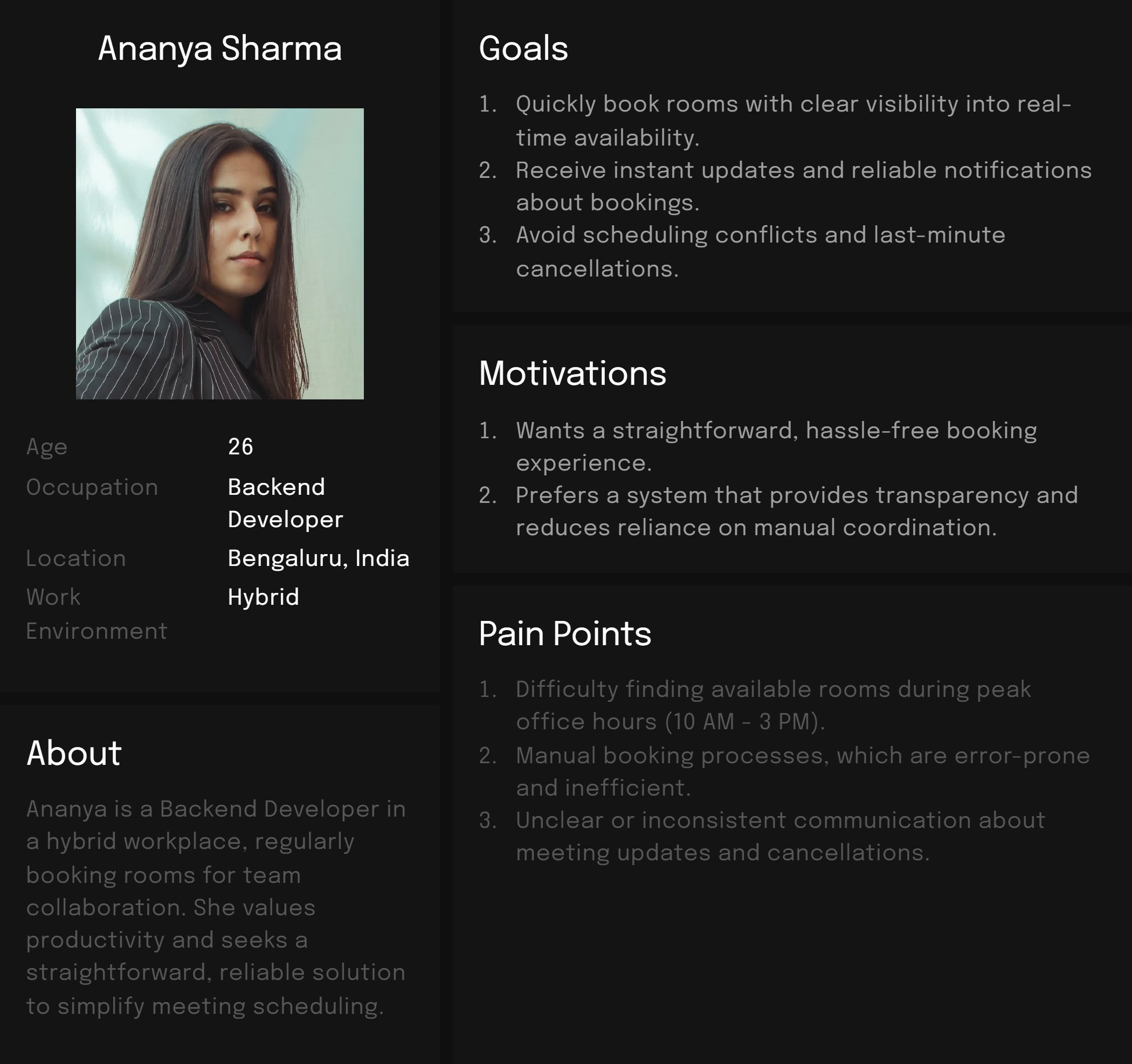
Define
Based on the insights gathered during the Empathize stage, I developed a clear definition of our primary user's needs, motivations, and pain points to guide the subsequent phases of the design process.

Ideate
Based on insights gathered during the empathy and define phases, I explored several ideas through scenarios, storyboards, and feature comparisons to address user pain points effectively. The objective was to ideate solutions that streamline the booking experience, enhance visibility into meeting room availability, and reduce manual coordination.
Scenario Exploration
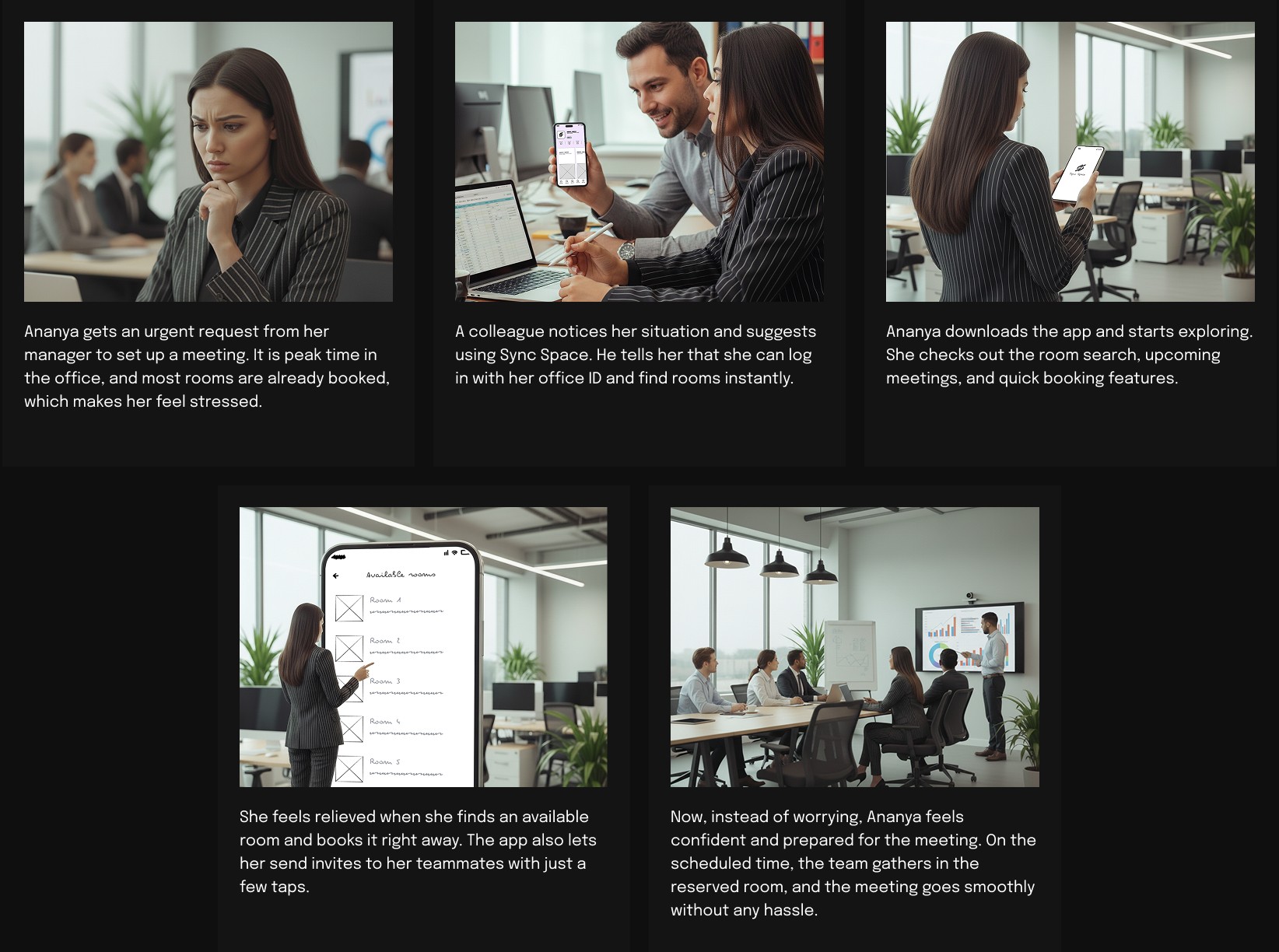
I envisioned a realistic scenario to demonstrate how Sync Space might transform Ananya's meeting room booking experience:
Ananya receives an urgent request from her manager to arrange a client meeting quickly. Typically, during peak hours, finding a meeting room is stressful and uncertain. Instead of manually checking spreadsheets or asking colleagues, Ananya decides to try Sync Space, a new room booking app recommended by her teammate. Within minutes, she effortlessly identifies an available room, quickly reserves it, and sends instant invitations to her colleagues. With the room securely booked, Ananya feels prepared and confident going into her meeting, knowing that the hassle of traditional methods has been completely avoided.


Design
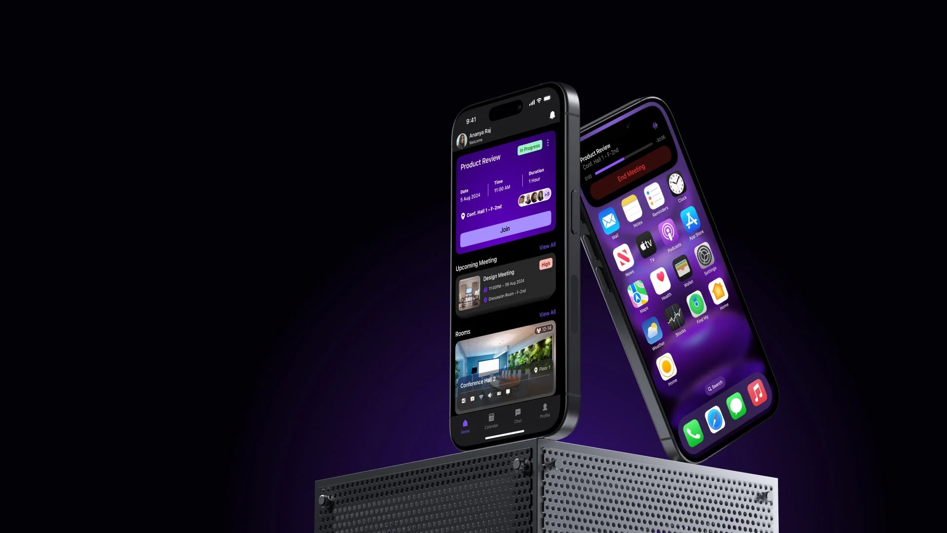
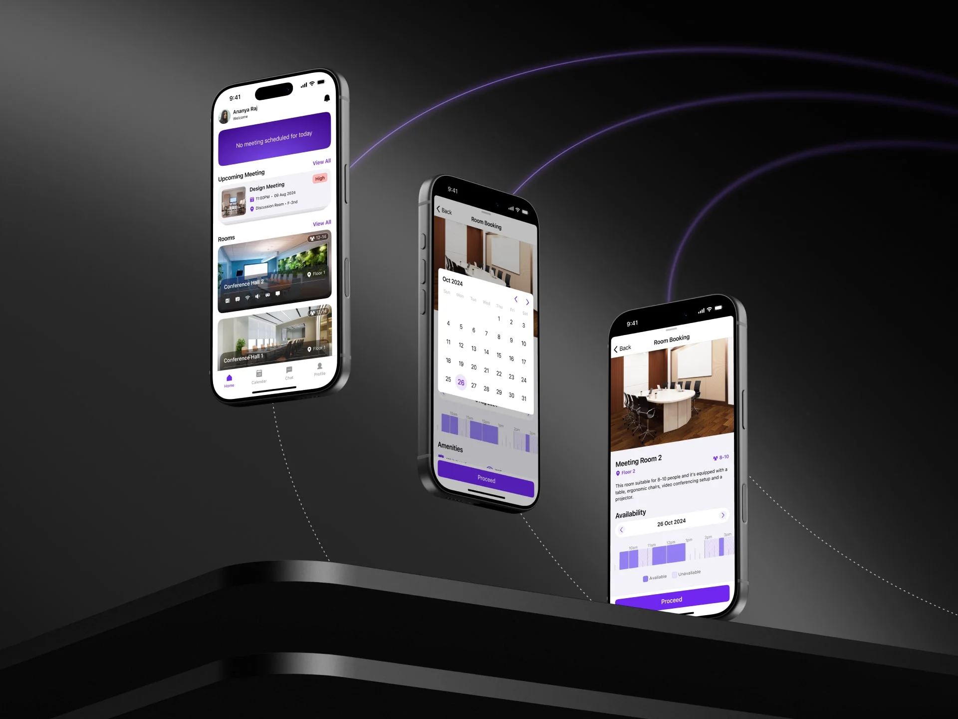
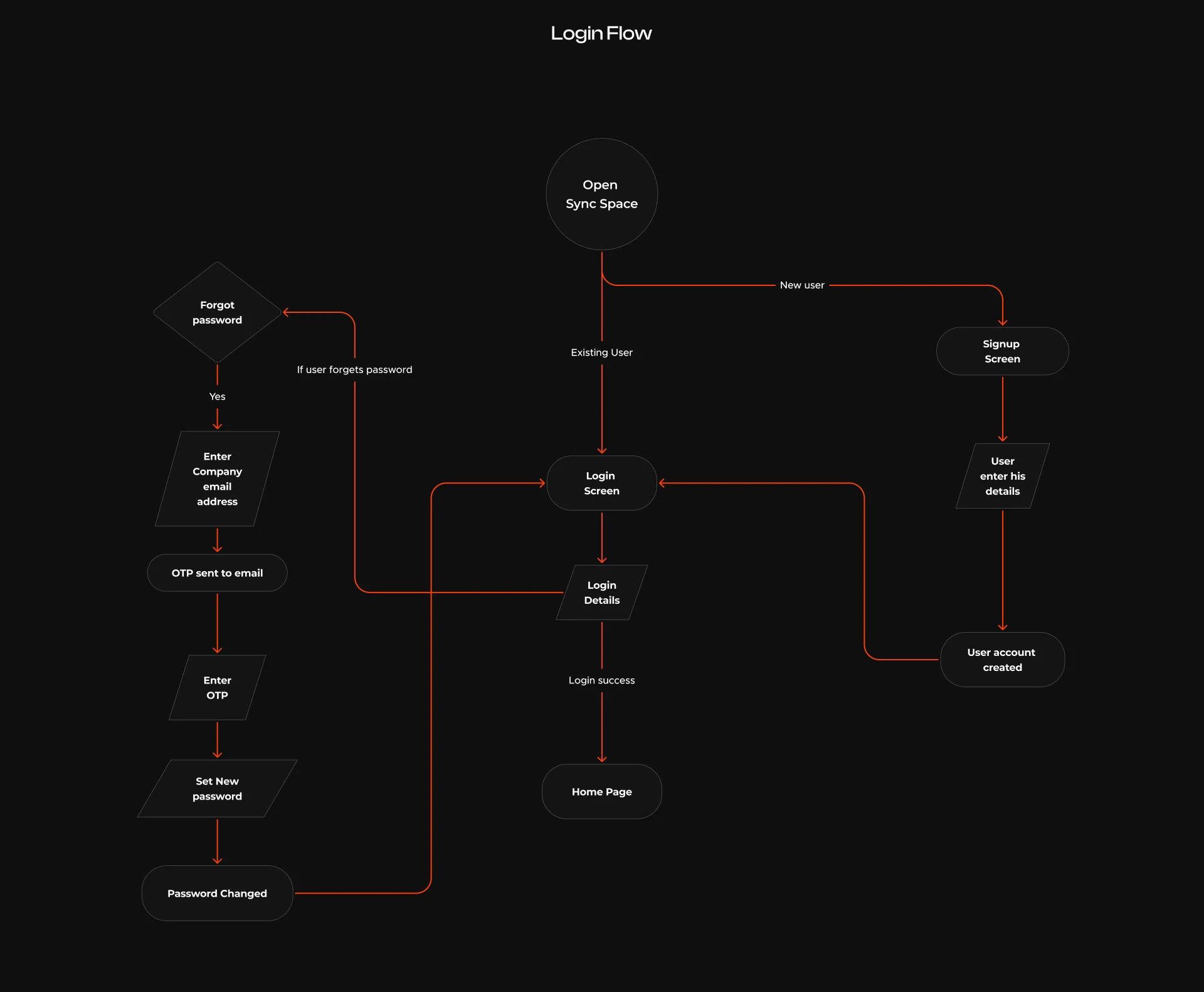
In the design phase, I translated the research insights into a clean and intuitive meeting room booking experience. I started with low-fidelity wireframes to define the core user flows, focusing on clarity, navigation, and reducing booking steps. These wireframes helped shape the overall structure before moving into detailed UI work.
The high-fidelity designs brought the product to life with a modern, minimal interface that supports quick scanning and fast decision-making. Consistent spacing, subtle elevations, clear room indicators, and a friendly typography system were used to keep the experience simple and reliable.
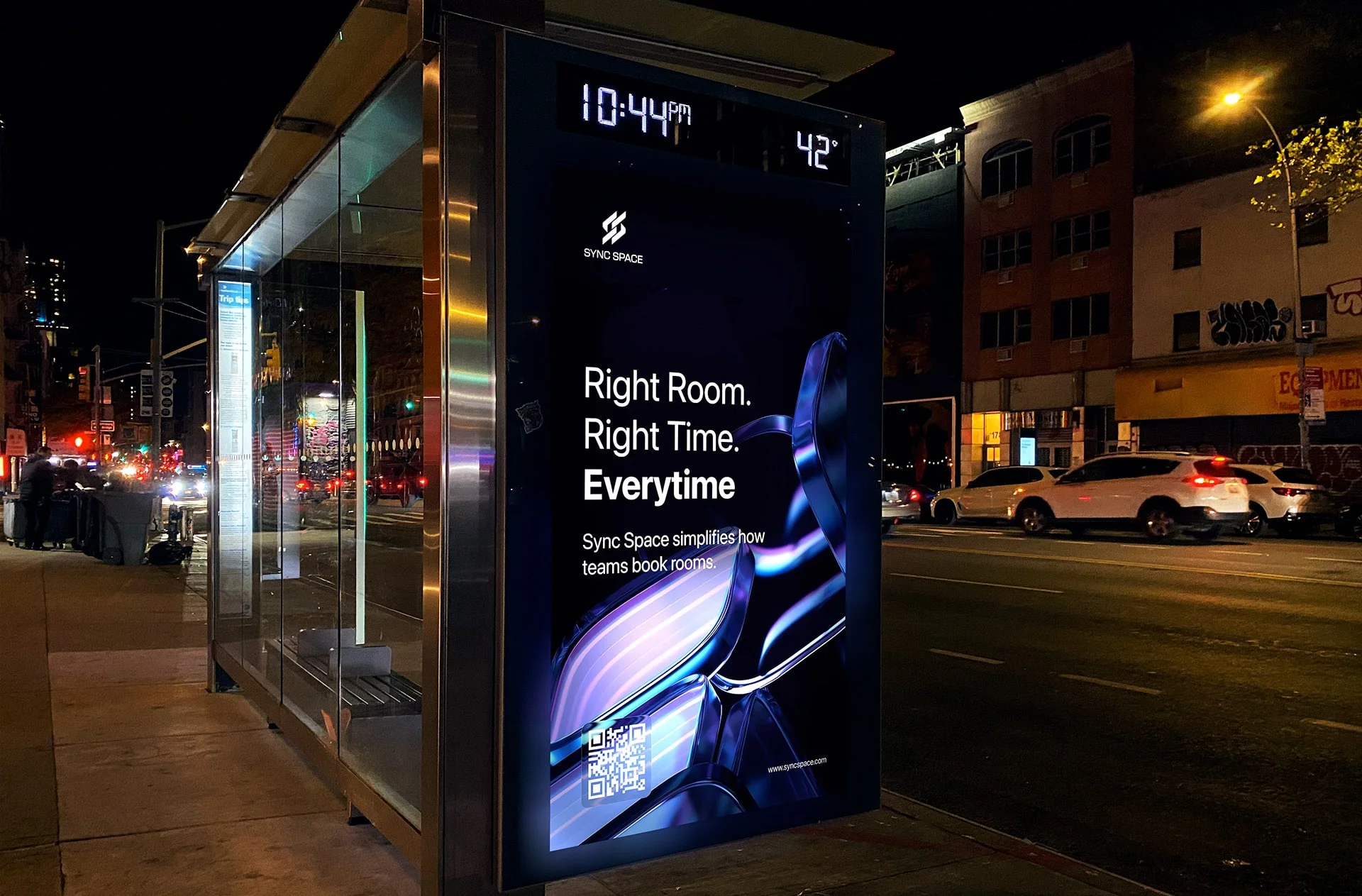
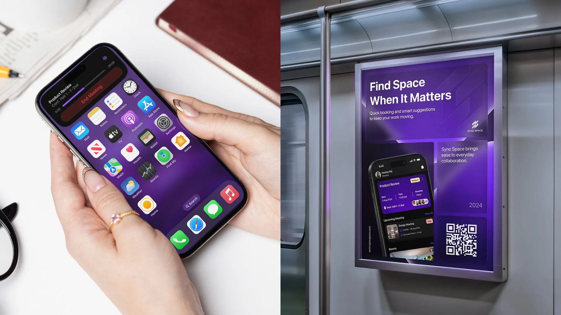
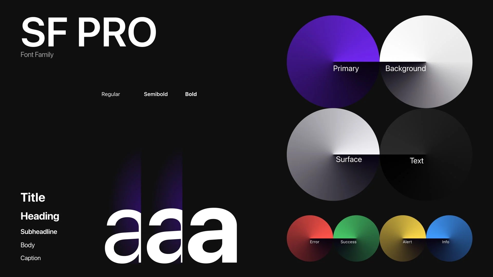
The Sync Space logo was designed to represent connection and alignment through interlinked shapes, while the name reflects the idea of syncing schedules and spaces. The primary purple color adds a distinctive, modern identity and highlights important actions, supported by a neutral base for balance.
Together, the wireframes, visual identity, and final UI create a cohesive, efficient, and easy-to-use system that simplifies meeting room booking for hybrid teams.


Usability Testing
Usability testing for Sync Space focused on validating whether users could
book meeting rooms, manage schedules, and coordinate with teammates
without friction. The testing was conducted using high-fidelity prototypes
covering key flows such as Home, Calendar, Chat, New Meeting, and New Room
Booking. Participants included employees from hybrid work environments with
frequent meeting dependencies.
The goal was to assess clarity of navigation, ease of decision-making, error
prevention, and overall confidence while completing time-sensitive tasks.
Key Observations
Users were able to complete core tasks such as booking a room or
scheduling a meeting without external guidance.The Home screen was immediately understood as a command center for
upcoming meetings and room availability.Calendar and Chat integration reduced context switching and helped users
move naturally from conversation to action.Step-by-step meeting creation flow felt structured and reassuring,
especially with the booking review and success confirmation screens.

Key Learnings
Clarity builds confidence
Clear hierarchy, consistent layouts, and predictable actions helped users feel in control, especially during urgent bookings.Progressive disclosure works well
Breaking complex tasks like meeting creation into smaller steps reduced cognitive load and errors.Visual availability cues matter
Room images, capacity indicators, amenities icons, and availability timelines helped users make faster decisions.Feedback reduces anxiety
Booking review screens, confirmation states, and timely notifications reassured users that actions were completed successfully.Integrated communication is a strong enabler
The ability to move from chat to meeting scheduling supported real-world work behavior and minimized manual coordination.Policies need contextual placement
Showing meeting policies within the flow improved compliance without feeling restrictive.