Product Designer 1
Research
Design Strategy
Visual Design
Prototype
Animation
Industry
Fintech
Platform
Mobile App (iOS & Android)
Team
Kapil Reehal, Om Ashish, Rahul Singh, Nishant Khandelwal
Overview
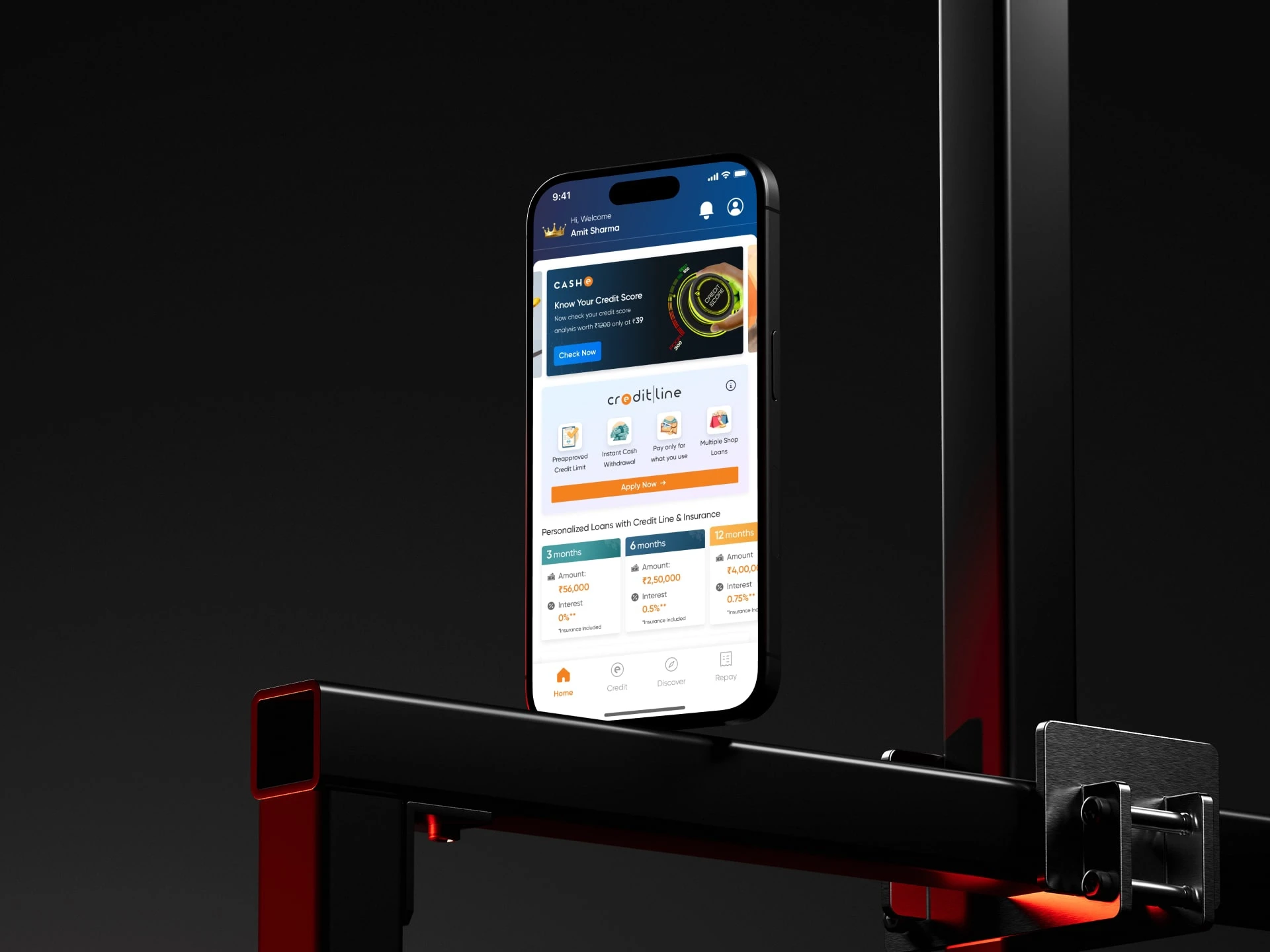
CASHe is a hassle-free one-stop shop for young professionals, specializes in providing instant money solutions by leveraging alternative data sources.
However, the mobile app design needed to be reworked, i.e., it didn't had a clear purpose. I began by understanding the users better, uncovering their challenges, and aimed to create an experience that felt seamless and easy to use.
Guided by proven UX principles and detailed research, I collaborated closely with cross-functional teams and the users themselves to build solutions that worked for everyone. Each step from pin pointing issues to testing ideas and fine-tuning the designs brought us closer to an app that’s practical intuitive and enjoyable.
The result was a transformed Cashe app that simplifies business operations and delights users with its intuitive and efficient design.
Problem Statement
Although the business model of CASHe was revolutionary, the execution and usability of the mobile app were not. It suffered multiple gaps in both user experience and overall design. The primary issues faced by users were:
Lengthy onboarding process leading to increased bounce rate.
Lack of clarity about eligibility and repayment terms for loan applications.
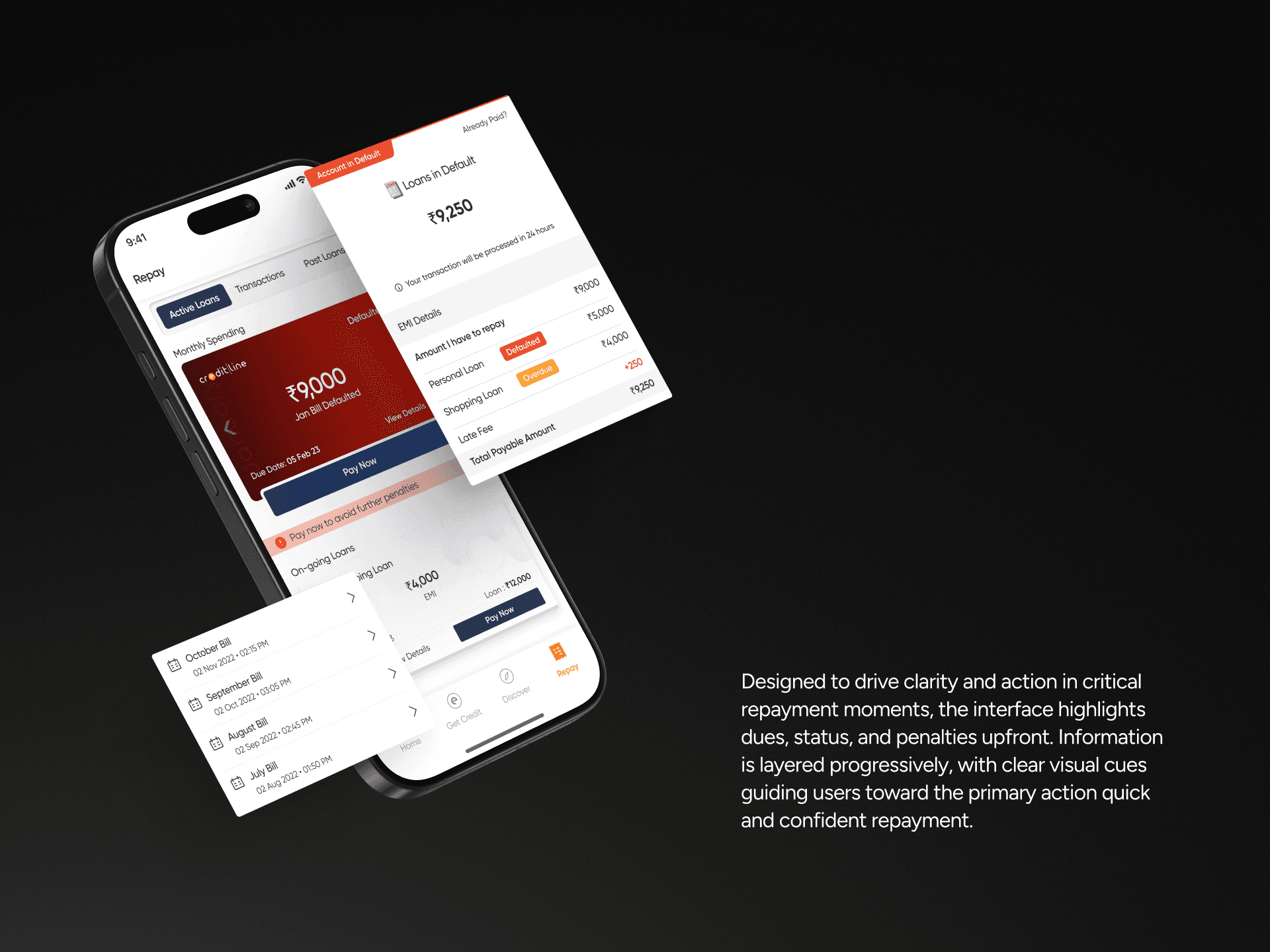
Unreliable repayment reminders and unintuitive BNPL usage.
Inconsistent UX writing across the app.
Obsolete app design, lacking modern interactive elements.
My Responsibilities
As the product designer on this project, I worked closely with product managers, developers, and the business team.
What I Handled:
Thoroughly conducting competitor analysis.
Identifying UX issues via user journey for the existing app.
Conducting user surveys and one-on-one interviews to identify gaps.
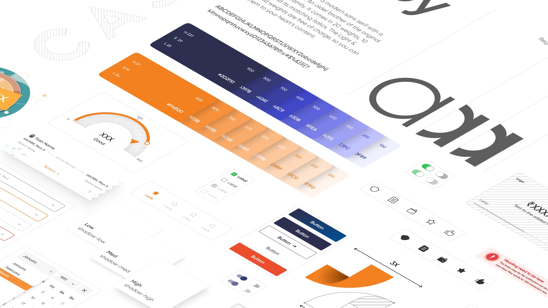
Crafting scalable design systems based on atomic design systems.
Streamlined user flows based on the research data.
Creating wireframes and finalizing the designs.
Motion animation and custom illustration followed by prototyping and testing.
Research & Insights
To better understand users and the issues they faced, I did the following:
Reviewed support tickets and app analytics
Interviewed users (anonymized) from both Tier 1 and Tier 2 cities
Conducted internal discussions with support and product teams
From this research, what we found:
Too many steps upfront caused users to drop off
Users wanted to know eligibility early to avoid wasting time
Trust was a big concern, especially around document uploads and data sharing
People expected a smoother experience like what they see in shopping or payment apps
These findings helped us focus the redesign on three key values: clarity, control, and confidence.
Strategy & UX Thinking
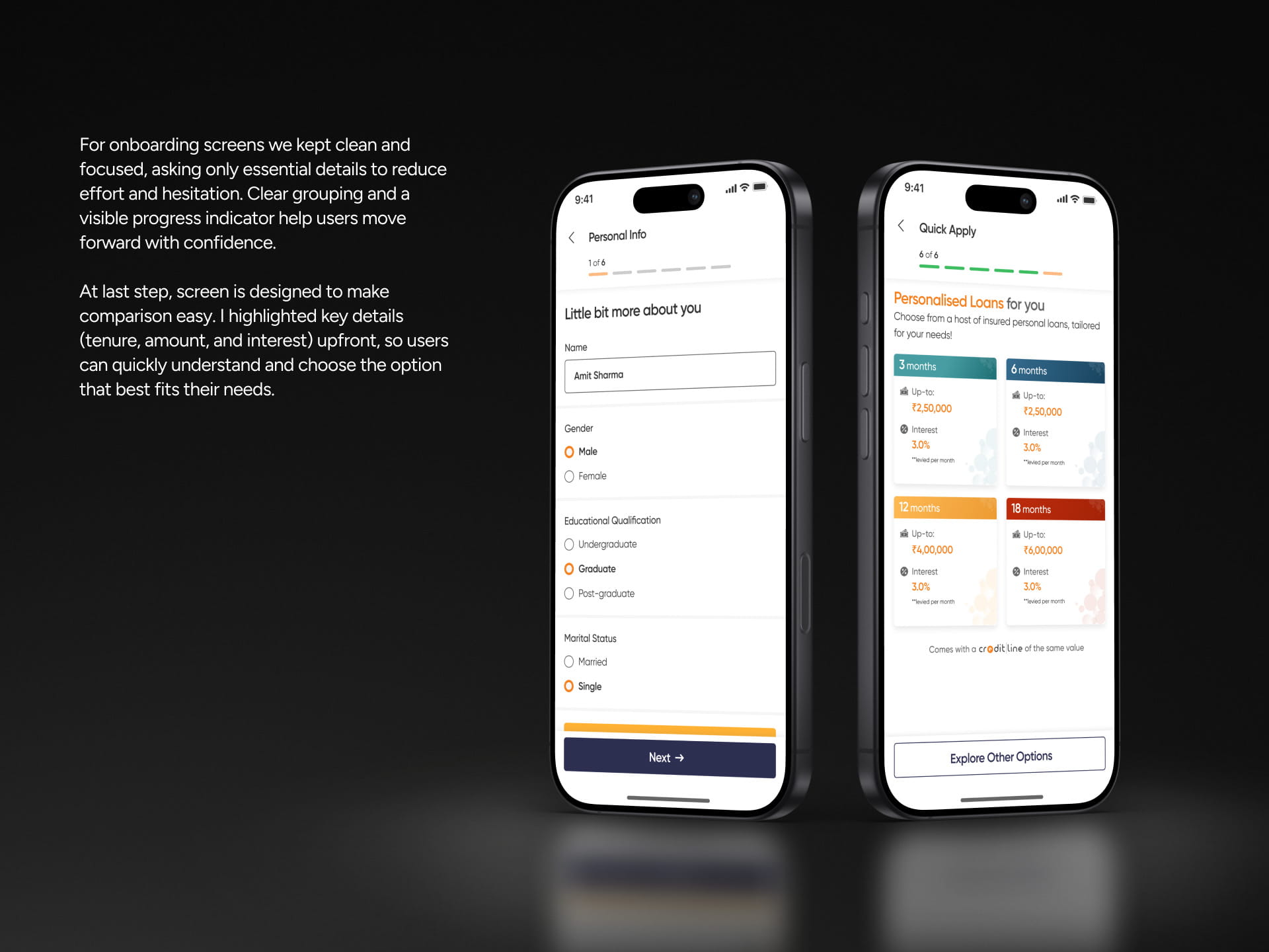
I decided to break the user journey into smaller, more intuitive steps. The plan was to:
Make each step feel lighter by focusing on one task at a time.
Present the loan eligibility earlier to the users, even if it’s an estimate.
Use clear, easy-to-understand, and friendly language across the app.
Personalize the flow for different user types based on their income and employment.
We also used a prioritization method to decide which features to build first and which could wait. Sketches and flow diagrams were used to align the team.
Design Process
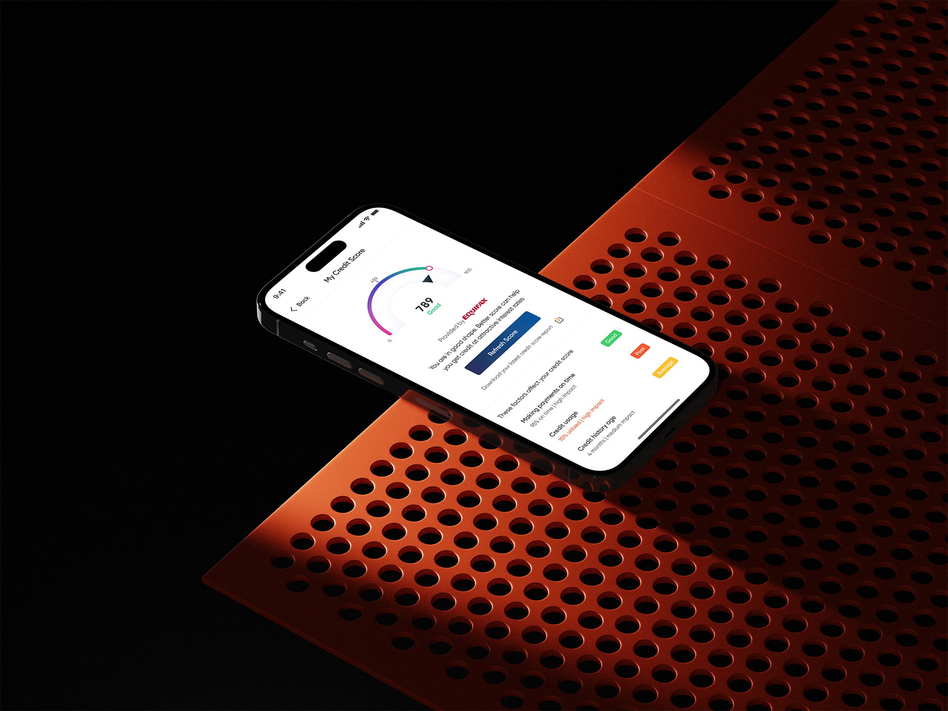
The design language of CASHe was built to feel vibrant yet trustworthy. Orange brought energy and optimism, while deep navy balanced it with stability and confidence.
We used the Gilroy font family for its clean and modern look, ensuring information stayed clear and approachable. To maintain consistency, I created a scalable design system from scratch, following atomic design principles, giving the app a flexible foundation for growth.
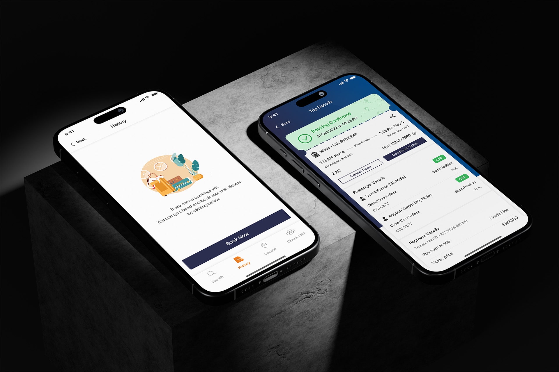
Custom illustrations and motion animations were also crafted to guide users through key moments like onboarding and repayments, making the experience more human and engaging.
Prototype & Testing
I built an interactive prototype and tested it with a small group of users. These sessions were moderated and recorded (with permission). The main goal was to see if users found the flow clearer and faster.
Here’s what worked well:
Breaking steps down made users feel less overwhelmed
Showing early eligibility increased user trust.
Adding trust markers made users more confident.
People understood the repayment options better when we used visuals instead of long text.
Outcomes & Feedback
Exact numbers are confidential, but based on feedback and team insights, we observed:
Higher completion rate for the new onboarding flow
Fewer support questions about document uploads and eligibility
More users returning to check loan offers after signing up
These improvements made the app easier to use and more trustworthy — both of which are crucial in a finance app.
Key Learnings
Working on this project allowed me to learn a few important lessons:
A step-by-step design helps users stay on track, especially for sensitive tasks (involving finances) that feel long or complicated.
Early transparency builds trust, especially in fintech.
Personalization makes users feel valued, and significantly improves engagement.
Even small design details like microcopy or progress indicators can make a huge impact.
It was a great reminder that good UX is not just about visuals, but about reducing friction and making people feel in control.