Role

Role

Product Designer 2

Services

Services

UX Research
Design Strategy
Visual Design
Prototype

COALESCE

COALESCE

COALESCE

COALESCE

COALESCE

COALESCE

2023
Featured image - SaaS design, Ui dashboard

Industry

Fintech

Platform

SAAS Platform

Team

Kapil Reehal, Om Ashish, Rahul Singh

Overview

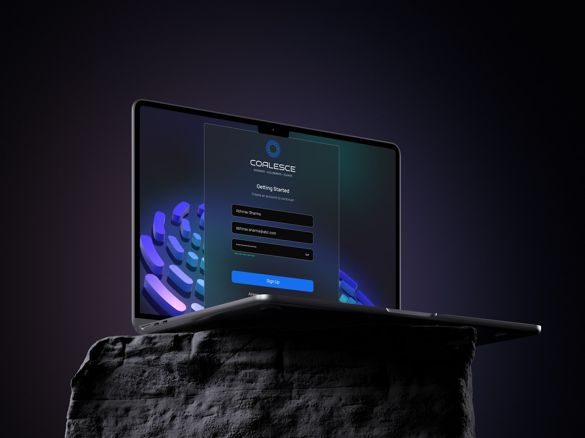
Making partner relationships simple, transparent, and self-service

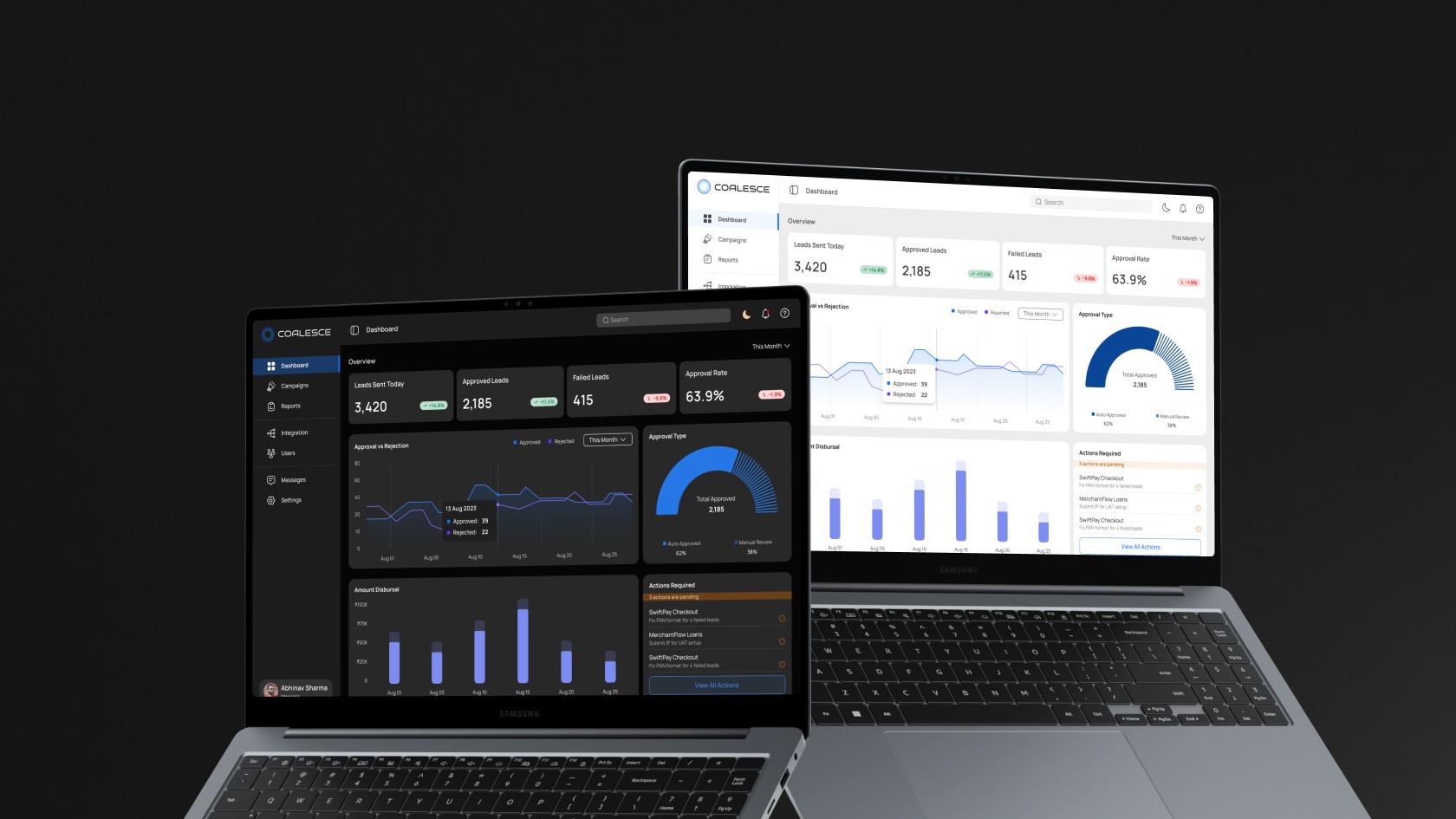
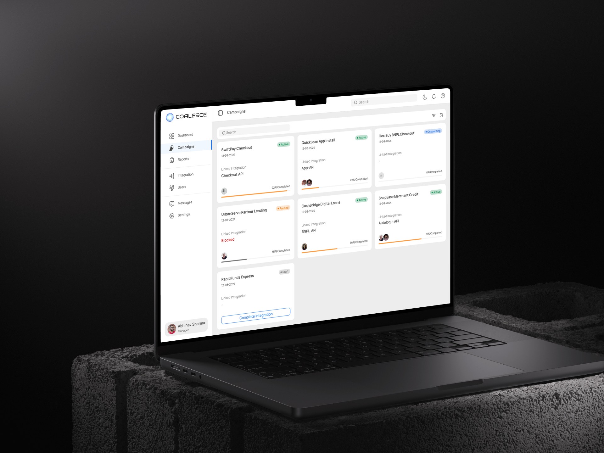
Coalesce is a web platform that helps financial partners manage their entire relationship with us in one place. Instead of juggling emails, spreadsheets, and phone calls, partners can now handle everything from getting started to running campaigns to downloading reports all under one dashboard.

The goal was simple: replace messy manual processes with a system where partners can see exactly what's happening, know what to do next, and get things done without waiting for our team to help them. This means faster results, fewer mistakes, and happier partners.

42%

Faster Onboarding

37%

Fewer Support Requests

31%

Fewer Setup Errors

29%

Higher Activation Rate

Coalesce_Saas_dashboard_UX_project_Kapil_reehal
Problem Statement

Scattered tools, frustrated partners, overwhelmed support team

Before Coalesce, partners had to manage everything through scattered emails and spreadsheets. This created chaos slow responses, mistakes, and frustrated partners who couldn't get simple questions answered.


What Was Going Wrong

Slow Onboarding

Getting started took weeks instead of days due to manual back-and-forth.

Zero Visibility

Partners couldn't see what was happening with their setup or campaigns

Repetitive Support

Our team kept answering the same questions over and over

Unclear Failures

When something failed, partners didn't know why or what to do next

Security Risks

Sharing reports manually created security vulnerabilities

Inconsistent Experience

Every partner's experience was different there’s no standardization


The Core Problem

Partners weren't frustrated because our product was bad, they were frustrated because they couldn't get answers to simple questions like "Where is my setup?" and "Why did this fail?" The real challenge wasn't technical complexity, it was communication and transparency.

My Role

Based on these insights, the experience was structured around clarity, guidance, and self-service. The platform was designed as a system rather than a collection of screens, allowing it to scale with increasing partner volume.

Each screen was designed to answer a single primary user question and clearly indicate next steps.

What I Did
  • UX research and user interviews

  • Created the UI design system

  • Built interactive prototypes

  • Ran usability testing sessions

  • Collaborated with engineering daily

Working with the Team

I worked closely with the product manager to make sure we were solving the right business problems and measuring success properly. With the engineering team, I met weekly to check if my designs were actually buildable and to catch technical roadblocks early.

I also partnered with the operations team, the people who actually talk to partners every day to understand real frustrations instead of just guessing. This teamwork helped us make smart choices and stay on the same page.

SaaS marketing campaign design
Research & Insights

Data-driven insights that shaped our strategy

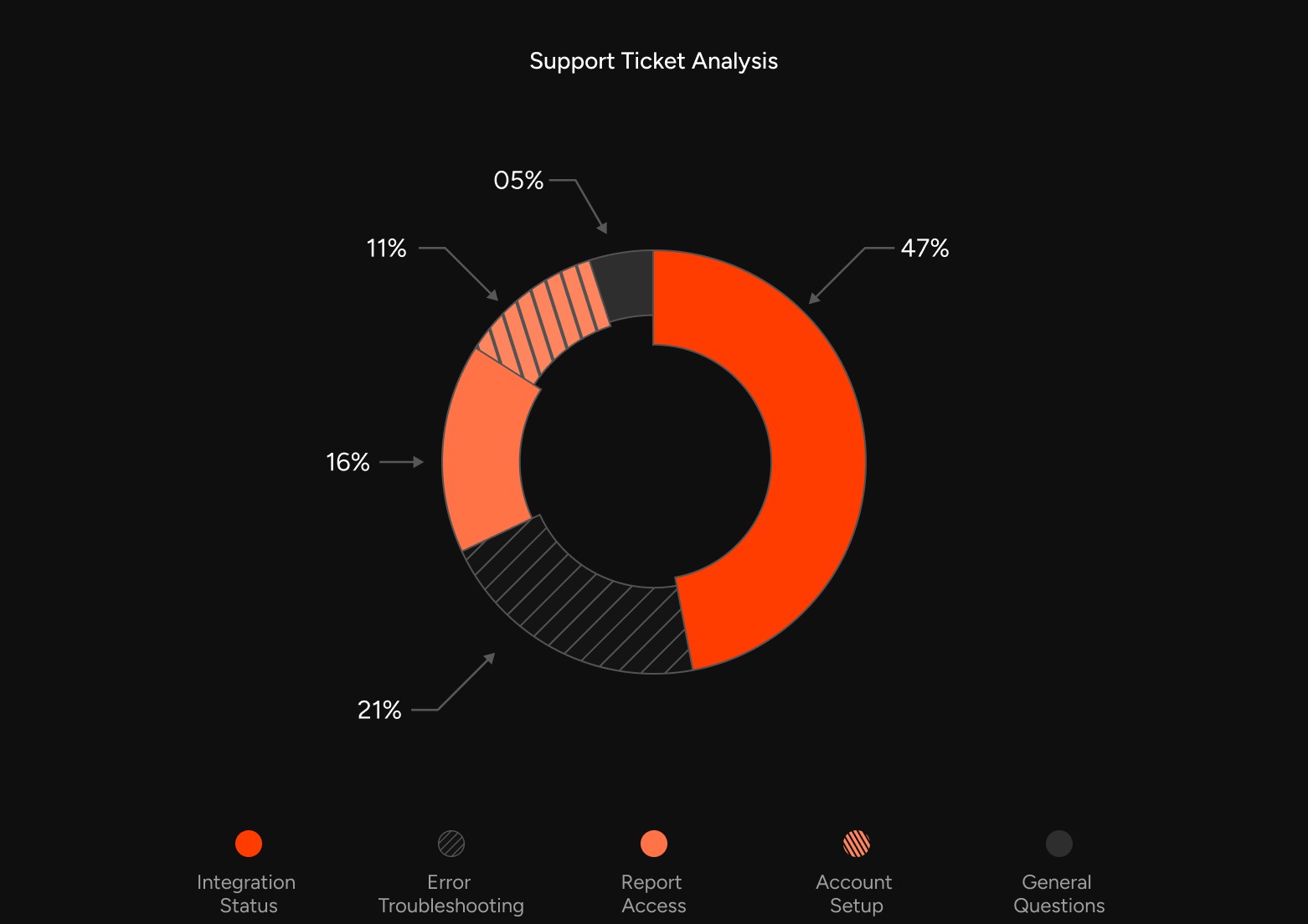
I started by digging into how things actually worked. I looked at support tickets, talked to the operations team, and tracked where partners got stuck or confused most often.


Key Research Activities
  • Analyzed 200+ Support Tickets

  • Interviewed 12 Partners

  • Mapped User Journeys

  • Identified Patterns


What I Discovered

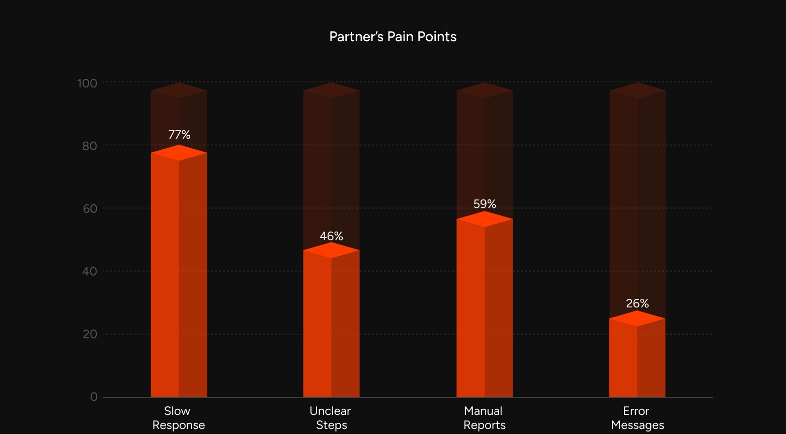
70% of Questions Were About Status

7 out of 10 partner questions were "Where is my setup?" and "Why did this fail?" These aren't technical questions & communication gaps

Progress > Documentation

Partners cared more about seeing progress than reading long technical guides. They wanted to know "Am I on track?" not "Here's how the API works."

Clarity Beats Complexity

Most problems weren't because things were too complicated, they were because steps weren't clear enough.

Trust Through Transparency

Partners needed secure access to reports to trust the platform. Security wasn't just a checkbox, it was a relationship builder.

Strategy & UX Thinking

Three principles that guided every decision


Clarity First

Make everything clear and easy to understand at a glance

Guide Partners

Show exactly what to do next, step by step

Enable Self-Service

Let partners help themselves without waiting


Tough Choices We Made

Self-Service Over Features

We chose to focus on transparency and self-service over adding lots of features in the first version. Stakeholders wanted fancy filtering and custom reports, but we said no.

Why: Our research showed 7 out of 10 problems came from partners not knowing what was happening, not from missing features. We agreed to add those extras later, once the basics proved successful.

Desktop Over Mobile

We designed for computers first, not phones. We found that 95% of partners do this work on laptops.

Why: This let us make the laptop experience amazing instead of spreading ourselves thin. We could launch faster and prove the concept worked.

Progress Over Perfection

We prioritized showing partners where they were in the process over creating pixel-perfect animations and transitions.

Why: Partners needed confidence more than eye candy. A simple progress bar that worked beat a beautiful interface that confused people

Design Process
Design Sprint Timeline

Week 1-2

Research & Discovery

Analyzed support tickets, interviewed partners and ops team, mapped current journey

Week 3-4

Information Architecture

Organized platform structure, defined user flows, created site map

Week 5-6

Wireframing

Created low-fidelity wireframes, tested concepts with stakeholders

Week 7

Design System

Built component library, defined colors and typography, created design tokens

Week 8-9

High-Fidelity Designs

Designed all screens, created interactive prototype, prepared dev handoff

Week 10

Testing & Iteration

Ran usability tests, refined based on feedback, finalized designs


Design System
Prototype & Testing

Interactive prototypes were created, so we could test ideas before spending time building them. The goal was focused to check if partners could actually do things on their own without calling for help.

8%

Partners Tested

5%

Key Tasks

3%

Rounds of Testing

92%

Task Success Rate


What We Tested
  • Can partners find their campaign status without help?

  • Can they understand what action to take next?

  • Can they complete integration setup independently?

  • Can they download reports securely?

  • Can they troubleshoot errors on their own?


Key Findings

Metric

Before

After

Task Completion Rate

67%

94%

Avg Time on Task

8.5 min

3.2 min

Setup Error Rate

42%

9%

Support Requests

73%

18%

User Confidence

45%

91%

SaaS app user list screen design
Outcomes

Coalesce delivered measurable improvements across partner experience and operational efficiency.

42%

Faster Onboarding

37%

Fewer Support Requests

31%

Fewer Setup Errors

29%

Higher Activation

Instant

Report Access

4.7/5

Partner Satisfaction

Outcomes

Coalesce delivered measurable improvements across partner experience and operational efficiency.

42%

Faster Onboarding

37%

Fewer Support Requests

31%

Fewer Setup Errors

29%

Higher Activation

Instant

Report Access

4.7/5

Partner Satisfaction

Coalesce_saas_profile_UX_project_Kapil_reehal
Key Learnings

Insights I'll carry into future projects

Design Lessons
  • Progress visibility cuts support dramatically - This is now my go-to for any complex workflow.

  • People want answers, not data - Show what matters, hide the rest.

  • Simple language wins - I now have non-technical people review all copy.

  • Constraints breed creativity - The 3-month deadline forced us to focus on what truly mattered.

Business Lessons
  • Design directly affects the bottom line - Better UX = less support cost + more revenue

  • Security builds trust - Rules and restrictions can enhance the product when designed well

  • Good structure pays off long-term - Time spent organizing properly saves months later

  • Measure everything - Define success metrics upfront and track them religiously